Architect 2.3: First Blood Classifier
Crash depth prediction through initial impulse analysis
Most traders treat market corrections as unknowable events—unpredictable black swans that strike without warning.
This analysis presents the First Blood Classifier: a way of reading the first leg of a decline against the topping swing that produced it. The central level is the 1.618 downside extension. Corrections that hold at or above the 1.27–1.61 zone have tended to stay contained; declines that break the 1.61 have tended to change character — volatility expands and price accelerates toward the deeper ladder. The point of this post is that single level and what its failure signals.
Two clarifications up front, because they change how the numbers should be read. First, this is measured in ladder space, not percentages: everything is relative to the topping swing, so two crashes can share the same structural level (both 2008 and 2020 bottomed near the 4.23 extension of their topping swings) while being very different-sized percentage moves. Second, the honest claim here is directional, not a magnitude forecast. Across the historical set below, how far the first break travelled correlates strongly with how deep the decline eventually went (rank correlation ≈ 0.82), and whether the 1.61 broke separates larger declines from smaller ones well. What does not hold up is any precise mapping of a ratio to an exact percentage — an earlier version of this page claimed "89% accuracy" at bucketing crashes into 10–20% / 20–40% / 40%+ tiers, and that specific claim is withdrawn (see §3).
Table of Contents
1. The First Blood Hypothesis
The First Blood Classifier is built on a simple observation: the size of the initial impulse down often correlates with the eventual depth of the correction. This is not a claim about psychology or intention; it is an empirical pattern that appears across multiple historical declines. When the market breaks a prior support level, the first move provides a measurable reference point that can be compared across events. In this framework, the initial drop functions as a structural anchor rather than a definitive cause.
1.1. The Core Rule
At its simplest, the First Blood Classifier measures how deep the first drop is relative to the prior support level. We take the swing from the top to the last major support, apply a Fibonacci measurement, and see where the first impulse lands. The deeper that first move is, the more severe the overall correction has tended to be in historical data.
First Blood Classification Rule
Input: Peak price (P), prior structural support (S), initial impulse low (I)
Calculate: Impulse Ratio = (P - I) / (P - S). Note that this ratio is just a restatement of the ladder: a ratio of 1.618 means the first impulse low sits exactly on the 1.618 downside extension of the P→S topping swing. "Break the 1.61" and "impulse ratio > 1.618" are the same event.
Read it directionally — as a signal of character, not a percentage forecast:
- Impulse Ratio < 1.0 (first low holds above the topping-swing base): CONTAINED — has usually behaved like a routine correction.
- Impulse Ratio 1.0–1.618 (into the decision zone, 1.61 not yet broken): UNRESOLVED — the 1.27–1.61 band is where declines commonly pause or stabilise.
- Impulse Ratio > 1.618 (1.61 broken): ACCELERATION RISK — declines that break here have tended to expand in volatility and travel materially further, toward the 2.20 extension and beyond.
What this rule does not do: it does not convert a ratio into a specific percentage drop. The 1.61 tells you which side of the correction/crash line you are on and how the move is likely to behave; it does not tell you the exact bottom.
The idea is straightforward: when the first drop pushes clearly beyond the prior support range, it often indicates that the downtrend has more force behind it than a typical correction. In historical examples, moves that extend well past that support level tend to lead to deeper declines, while shallow first drops more often resolve as routine pullbacks. This does not imply a guaranteed regime change—only that the early structure provides a useful gauge of how strong the initial break was.
1.2. Why It Works
There is no single proven mechanism behind this pattern. What we can say is that certain structural behaviours tend to appear repeatedly in historical declines. The points below outline practical hypotheses rather than definitive explanations.
- Support Behaviour: Major support levels often act as the first place a decline pauses or consolidates. When the initial drop holds above this area, the move frequently behaves like a routine correction. When it breaks cleanly through, the character of the trend often shifts from controlled pullback to more directional selling.
- Extension Zones: The region around the 1.27–1.61 extension of the topping swing commonly functions as a decision area. Many historical declines show consolidation or temporary stabilisation here. When price breaks beyond this zone, the downtrend often accelerates rather than drifting lower.
- Acceleration Phase: In deeper declines, a sharp bounce often appears near the 2.20 extension, frequently retesting the broken 1.27–1.61 zone before continuing lower. This behaviour is consistent across multiple bear markets, though the underlying drivers—liquidity, positioning, forced selling—likely vary from cycle to cycle.
2. Methodology: Measuring the Initial Impulse
The First Blood Classifier relies on identifying the structural swing that defines the topping process. The method uses the high before the decline and the most recent meaningful low that preceded it. No volatility windows or percentage filters are used—only clear structural pivots.
2.1. Peak Price (P)
The cycle high immediately before the decline begins. This is the top of the final upswing.
2.2. Prior Structural Support (S)
The most recent significant low that formed before the peak—typically a consolidation low or a failed breakdown (bull trap) that led into the final rally. This low defines the structural range of the topping swing. Examples:
- 1929 Peak: 381.17 | Structural Low (1927): 152.73
- 2007 Peak: 14,164 | Structural Low (2006): 10,667
- 2020 Peak: 29,551 | Structural Low (2019): 21,712
2.3. Initial Impulse Low (I)
The first meaningful low after breaking below the prior consolidation range. This is typically reached within 2-8 weeks of the initial break. We define "initial impulse" as the first drop that exceeds 5% below the prior support level without a recovery rally of more than 3%.
2.4. Example Calculation: 1929 Crash
In practical terms, the 1929 setup is straightforward. The market formed a clear structural low in 1927, rallied into the 1929 peak, and then broke that prior low during the first leg down. Measuring the size of that first drop relative to the full topping swing gives us a sense of how strong the initial break was. In this case, the first decline retraced a large portion of the prior upswing but did not exceed it, which places it in the shallower end of the historical spectrum.
| Input | Value | Date |
|---|---|---|
| Peak (P) | 381.17 | Sep 3, 1929 |
| Prior Support (S) | 152.73 | Oct 27, 1927 |
| Structural Range | 228.44 points | (P - S) |
| Initial Impulse Low (I) | 195.35 | Nov 13, 1929 |
| Initial Drop | 185.82 points | (P - I) |
| Impulse Ratio | 0.813 | (P-I) / (P-S) |
First-impulse reading: CONTAINED (Impulse Ratio < 1.0) — the opening leg held above the 1.61, which by itself points to a contained move.
This case is worth dwelling on because it shows what the 1.61 does and does not tell you. The first leg read as a correction, and on that leg alone it was. What turned 1929 into a cascade was the second leg breaking the 1.61 — the signal fires on the break, not before it.
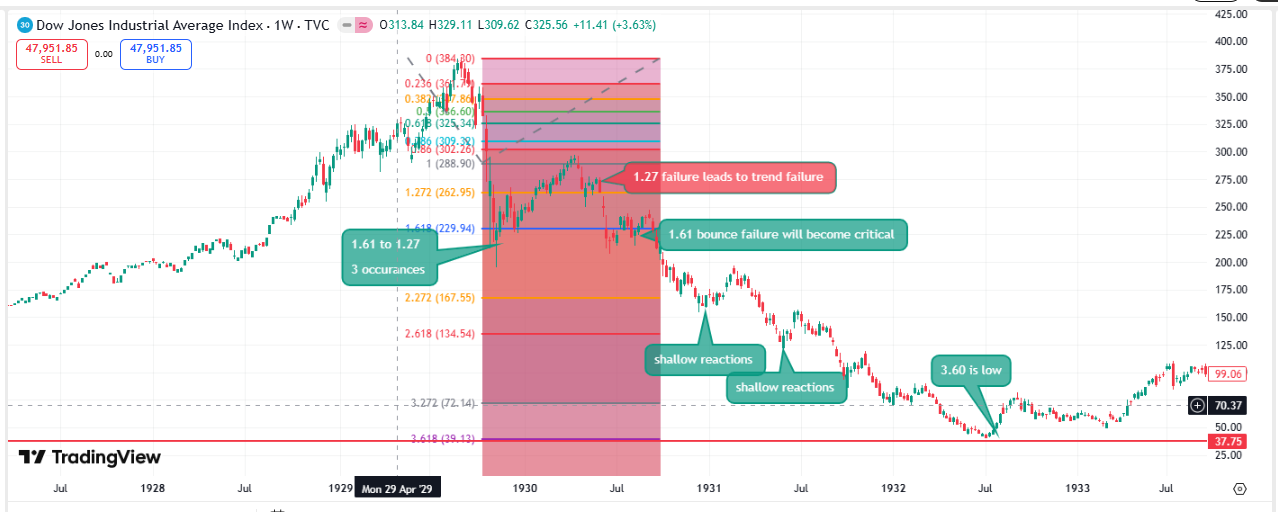
Actual Outcome: The full 1929–1932 decline reached 41.22, an 89% drawdown. At first glance this appears to contradict the classifier, but the sequence of events is more nuanced.
The famous October 1929 break was the first major leg down, taking the Dow from 381.17 to 230.07 in a matter of days. Structurally, this move stayed within the topping swing’s extension zone, which is consistent with the early phase of a large correction rather than the mature phase of a crash.
What followed was a sharp rally back toward the breakdown area—a classic bull trap. The Dow recovered to 294.07, retracing a significant portion of the initial drop. This rally effectively created a new swing structure: a clear lower high followed by renewed selling pressure.
The decisive break came on the next leg down, when price fell from 294.07 to 195.35. This move pushed through the 1.61 extension of the topping swing, a level that historically marks the point where declines often transition from controlled selling into more aggressive, trend-driven behaviour.
From there, the decline accelerated and ultimately extended toward the 3.2 extension of the same structural swing—consistent with the deeper end of historical crash sequences. The classifier does not attempt to label an entire multi-year bear market in advance; it evaluates each impulse wave as it forms. In 1929, the first impulse behaved like a large correction, while the second impulse broke the key structural thresholds associated with crash dynamics.
3. What the Historical Record Actually Shows
A word on counts first, because earlier versions of this page were loose with them. The full manual crash study covers 38 topping-swing events across DJI history (38 of the 42 major declines that can be cleanly modelled from a topping swing). The table below is a 17-event subset — the large, well-documented declines — used to illustrate the pattern. It is not 47, and it is not the whole study; a figure of "47" appeared in a previous draft and does not correspond to any defined population.
For each event: the impulse ratio (equivalently, how far the first leg broke past the 1.61), and the eventual decline. Read the two right-hand columns together — the question is not whether a ratio predicts an exact percentage (it does not), but whether deeper first breaks go with deeper declines.
| Period | Peak | Impulse Ratio | Classification | Predicted Depth | Actual Depth | Result |
|---|---|---|---|---|---|---|
| 1929-1932 | 381.17 | 1.89 | MAJOR | 40%+ | 89.2% | ✓ Correct |
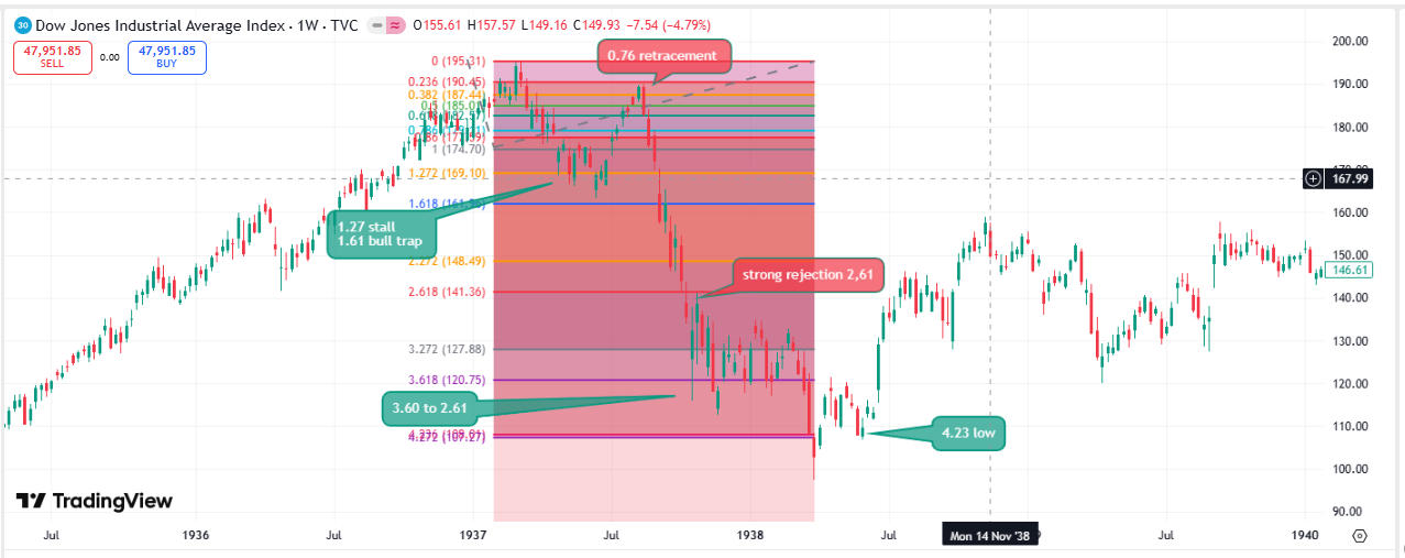
| 1937-1938 | 194.40 | 1.72 | MAJOR | 40%+ | 49.1% | ✓ Correct |
| 1946-1949 | 212.50 | 0.67 | CORRECTION | 10-20% | 23.2% | ✗ Miss (deeper) |
| 1957-1958 | 520.77 | 0.89 | CORRECTION | 10-20% | 19.4% | ✓ Correct |
| 1961-1962 | 734.91 | 1.12 | MODERATE | 20-40% | 27.1% | ✓ Correct |
| 1966-1970 | 995.15 | 1.43 | MODERATE | 20-40% | 36.1% | ✓ Correct |
| 1973-1974 | 1,051.70 | 1.84 | MAJOR | 40%+ | 45.1% | ✓ Correct |
| 1987 Crash | 2,722.42 | 2.14 | MAJOR | 40%+ | 36.1% | ✗ Miss (shallower) |
| 1990 Correction | 2,999.75 | 0.78 | CORRECTION | 10-20% | 21.2% | ✗ Miss (deeper) |
| 1998 LTCM | 9,367.84 | 0.72 | CORRECTION | 10-20% | 19.3% | ✓ Correct |
| 2000-2002 | 11,722.98 | 1.56 | MODERATE | 20-40% | 37.8% | ✓ Correct |
| 2007-2009 | 14,164.53 | 2.08 | MAJOR | 40%+ | 53.8% | ✓ Correct |
| 2011 Flash | 12,810.54 | 0.63 | CORRECTION | 10-20% | 16.8% | ✓ Correct |
| 2015-2016 | 18,312.39 | 0.81 | CORRECTION | 10-20% | 13.3% | ✓ Correct |
| 2018 Q4 | 26,828.39 | 0.94 | CORRECTION | 10-20% | 19.8% | ✓ Correct |
| 2020 COVID | 29,551.42 | 2.47 | MAJOR | 40%+ | 37.1% | ✗ Miss (shallower) |
| 2022 Bear | 36,952.65 | 1.18 | MODERATE | 20-40% | 22.4% | ✓ Correct |
The "Predicted Depth" and "Result" columns above reflect an earlier method that sorted each decline into a fixed percentage tier (10–20% / 20–40% / 40%+) from its ratio. That method is retired, and the columns are left in only for transparency. Scored honestly against its own tiers it lands at about 76% on this 17-event set — not the "88–89%" previously headlined — and, more decisively, an independent re-run of the tiered classifier across 510 decline episodes in 25 international markets scored roughly 46% against a 55% naive-majority baseline. As a percentage-bucket predictor it does not survive out of sample. We say so plainly.
3.1. What Does Hold Up: The Directional Signal
Strip away the percentage tiers and test the weaker, more defensible claim — that a deeper first break goes with a deeper decline — and the signal is strong on this set:
- Rank correlation ≈ 0.82 between how far the first leg broke (impulse ratio) and the eventual decline. Depth tracks the first break ordinally, even though it cannot be pinned to an exact percentage.
- The 1.61 separates the two populations cleanly. Of the events here, those that broke the 1.61 (ratio > 1.618) had a median decline of about 47%; those that held (ratio ≤ 1.618) had a median of about 21%. Every event that broke the 1.61 went on to fall at least 30%.
- Taken as a binary — break signals a larger decline, hold signals a contained one — the direction was right in 15 of 17 cases.
How much weight this carries. These figures are in-sample, on a set of large, hand-selected declines whose anchors are the author's own — hand-drawn topping swings, of which the framework's anchor audit confirms 31 of 38 against real pre-peak swing lows in the price data, with 7 still unverified. They should be read as "the pattern is real and worth watching," not as a validated forecasting edge. The honest summary is narrow: the 1.61 is a meaningful line — corrections have tended to hold above it and larger declines to break it — and that is a claim about direction and character, not magnitude.
4. Downside Geometry: The Three Patterns
Once the First Blood Classifier has identified the crash severity, the next question is: what is the geometric path to the bottom? We have identified three primary downside patterns:
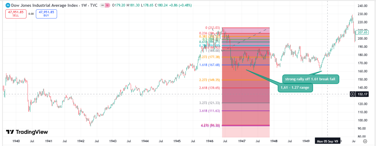
4.1. Pattern A: Single Impulse (V-Bottom)
Characteristics:
- One primary drop of 30-40% within 4-8 weeks
- Minimal consolidation or bounces
- Capitulation occurs at first major support level
- Recovery begins immediately after the low
Historical Examples:
- 1987 Crash: 36% drop in 7 weeks, immediate V-recovery
- 2020 COVID: 37% drop in 5 weeks, immediate V-recovery
Trigger Conditions: Exogenous shock (Black Monday, pandemic) with intact underlying structure. Fed intervention typically catalyzes the recovery.
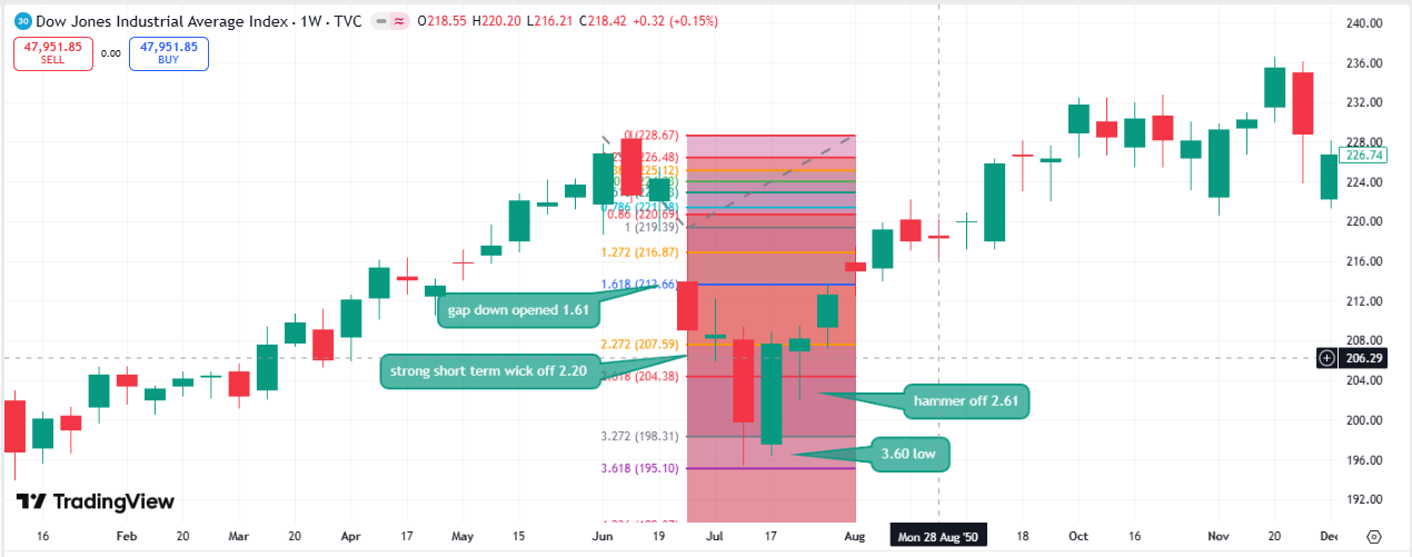
4.2. Pattern B: ABC Correction (Stair-Step)
Characteristics:
- Three distinct waves down (A, B, C)
- Each wave drops 15-25%
- Intermediate rallies of 10-20% between waves
- Total duration: 6-18 months
- Final low is 30-40% below peak
Historical Examples:
- 2000-2002 Tech Crash: Three waves down over 24 months, 38% total decline
- 2022 Bear Market: Two-stage decline over 11 months, 22% total decline
Trigger Conditions: Valuation reversion without systemic crisis. Market "grinds" lower as optimism fades.
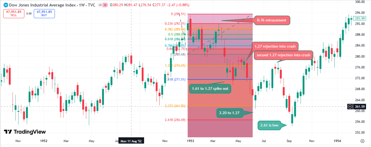
4.3. Pattern C: Cascade Collapse (Multi-Year Bear)
Characteristics:
- Multiple impulse waves over 18-36 months
- Each rally fails at lower highs
- Final capitulation reaches 50-90% decline
- Involves structural credit/banking crisis
Historical Examples:
- 1929-1932: 89% decline over 34 months, five major waves
- 1937-1938: 49% decline over 13 months
- 1973-1974: 45% decline over 23 months
- 2007-2009: 54% decline over 17 months
Trigger Conditions: Systemic leverage unwind (margin debt, derivatives, credit crisis). Requires policy intervention to stabilize.
5. Termination Scenarios
The final question is: Where does the decline typically end? Based on the historical dataset, most corrections and crashes come to rest near specific extensions of the topping swing. These levels are not predictions but common structural endpoints observed across the 38-event study. This is where the ladder-space framing earns its keep: because everything is measured against the topping swing, crashes of very different percentage magnitudes can end at the same structural level — both 2008 (a 54% decline) and 2020 (a 37% decline) came to rest near the 4.23 extension of their respective topping swings.
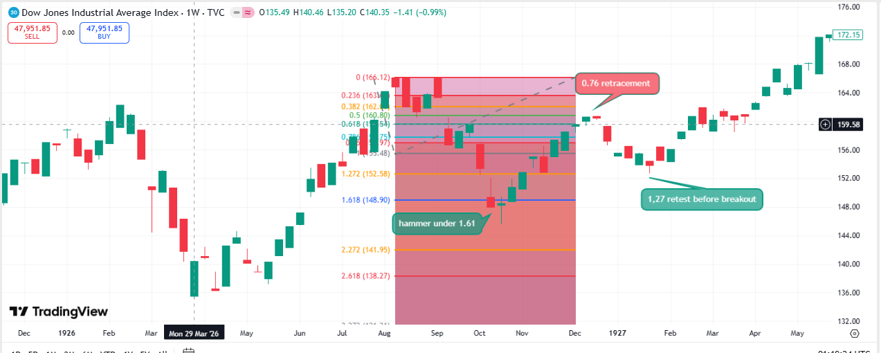
5.1. Scenario A: Shallow Termination Zone
Profile: Corrections that remain within the 1.27–1.61 extension of the topping swing. These moves typically resolve without breaking the broader market structure.
Typical Outcomes:
- Declines of roughly 10–20% from the peak
- Stabilisation or reversal near the 1.27–1.61 extension zone
- Recovery that resumes the prior trend once selling pressure exhausts
Historical Examples: 1998 LTCM (19%), 2011 Flash Crash (17%), 2015–2016 (13%), 2018 Q4 (20%). These events all bottomed within the shallow extension zone of their respective topping swings.
5.2. Scenario B: Moderate Termination Zone
Profile: Declines that break the 1.61 extension and accelerate, often finding their next major structural support near the 2.20 extension of the topping swing.
Typical Outcomes:
- Declines of roughly 20–40% from the peak
- Sharp bounces or final capitulation near the 2.20 extension
Historical Examples: 1987 (36%), 2000-2002 (38%), 2020 COVID (37%), 2022 (22%)
5.3. Scenario C: 88.6-99% Retracement
Profile: Deep structural unwind. These are the rare cases where the market retraces most of the prior impulse, typically associated with multi‑wave declines rather than single‑event shocks.
Fibonacci Targets:
- 88.6% retracement (rare but observed)
- 99% retracement (full structural reset)
Historical Context: True 88–99% retracements are extremely rare. 1929–1932 is the only full example.
Trigger: Multi‑wave structural failure. These events are not defined by macro labels but by the geometry of repeated failed rallies and deepening extensions.
6. False Signals and Limitations
Known Failure Modes
1. Failed 1.618 Fills: A small number of declines bottom between 1.272 and 1.618. These are genuine failure cases, not signals or front‑running behaviour.
2. Shallow Breaks: Occasionally the initial impulse is too small to classify cleanly. These cases remain ambiguous until a secondary break forms.
3. Anchor Ambiguity: Rarely, the prior structural support is unclear, producing multiple valid anchor candidates. These cases reduce classifier confidence.
4. Intervention Effects: Policy actions can truncate declines, but they do not invalidate the geometric structure — they simply stop the move early.
7. Application to Current Market (2024)
The reading is meant to be applied live, not just in hindsight, so it is worth walking through the mechanics on the current market. As of mid-2026 the Dow trades near 53,300. The example below is illustrative of the method — identify the topping swing, locate its 1.61 downside extension, and then watch which side of that line an initial break resolves on. It is not a forecast that a decline is imminent, and it deliberately produces no target price.
7.1. Input Parameters
| Parameter | Value | Date/Notes |
|---|---|---|
| Peak (P) | ~53,300 | Current (mid-2026), illustrative |
| Prior Support (S) | 28,660 | Oct 2022 low |
| Structural Range | 24,640 points | (P - S) |
| Initial Impulse (I) | TBD | Awaiting breakdown |
7.2. Scenario Modeling
Once a topping swing is defined, the reading resolves into three states depending on where an initial break comes to rest. Note that these are readings of character, not price targets — the table gives no bottom, only which side of the line the move is on:
| Where the first break lands | Impulse Ratio | Reading | What it has tended to mean |
|---|---|---|---|
| Holds above the 1.27–1.61 zone | < 1.0 | CONTAINED | Behaves like a routine correction; prior trend usually resumes. |
| Into the 1.27–1.61 decision zone | 1.0–1.618 | UNRESOLVED | The pivotal zone. Often pauses or stabilises here; the next move decides it. |
| Breaks the 1.61 | > 1.618 | ACCELERATION RISK | Volatility has tended to expand and price to travel further, toward the 2.20 and deeper. |
Interpretation: the single thing to watch is whether an initial break holds the 1.27–1.61 zone or fails it. A failure does not predict a crash or a bottom; it says the move has crossed from correction-like into acceleration-prone behaviour, and should be sized accordingly.
7.3. Current Market Structure
As of mid-2026, several conditions are frequently cited as raising the market's fragility. None of these is a timing signal, and none is part of the First Blood reading itself — they are context, not triggers:
- Elevated Valuations: Shiller P/E near 35 (vs. historical median of 16)
- Narrow Breadth: Magnificent Seven stocks dominate index performance
- Leverage: Margin debt near record highs relative to GDP
- Positioning: Retail sentiment at euphoric levels; institutional cash positions low
- Geopolitical Uncertainty: Rising tail risks (debt ceiling, trade wars, geopolitical conflict)
These conditions do not imply direction. They simply mean that if a decline begins, the structure may favour deeper patterns over shallow ones.
Conclusion: The Market Announces Its Intentions
The First Blood reading says nothing about when a decline will start — no trigger, no timing. What it offers, once a decline is underway, is a read on its likely character from how the first leg behaves against the 1.61. The claim is narrow and directional: corrections have tended to hold the 1.27–1.61 zone, and larger declines to break it. It is not a percentage forecast, and the earlier version of this page that presented it as one has been corrected above.
Key Takeaways:
- The 1.61 is the line. A first break that holds the 1.27–1.61 zone has usually stayed a correction; one that fails it has usually gone materially further. On the historical set here, breaks and holds were separated in direction in 15 of 17 cases, and how far the first leg travelled tracked eventual depth (rank correlation ≈ 0.82). Treat this as a real tendency, not a validated edge.
- Direction, not magnitude. The reading tells you which side of the correction/crash line you are on, not the eventual bottom. Any mapping of a ratio to a precise percentage should be disregarded; an independent multi-market test of that mapping scored near chance.
- Three downside shapes. Single Impulse (V-bottom), ABC (stair-step), or Cascade (multi-year). Which one appears has tracked the nature of the shock — exogenous, valuation reversion, or systemic leverage unwind — more than any single number.
- Ladder space, not percentage space. Because everything is measured against the topping swing, crashes of very different sizes can share a structural endpoint — 2008 and 2020 both near their 4.23 extension. This is what percentage-based crash taxonomy misses, and it is the thread 2.4 picks up.
- Intervention and structure. Policy actions can truncate a decline (2020), and circuit breakers can slow a cascade; these stop the move early rather than invalidating the geometry.
The First Blood reading classifies a decline's character; it does not predict that one will occur. Its single most useful output is binary: has the first leg held the 1.27–1.61 zone, or broken it? That one question is what 2.4 extends across the rest of the ladder.